

Dynamic number of items
Dynamic Number of Items in DragBuilder
In DragBuilder, certain composables like LazyColumn, LazyRow, and LazyVerticalGrid allow you to generate a dynamic number of child items based on your data sources. This is particularly useful when you want to display lists or grids of data that can change in size, such as:
- Binding to app states that contain lists of a data type.
- Displaying results from external APIs that return JSON responses with variable lengths.
Overview
- Lazy Composables: Special composables that efficiently display large or dynamic datasets by only rendering items currently visible on the screen.
- Data Sources: Lists or collections of data that you bind to lazy composables to generate UI elements dynamically.
- Dynamic Items: The individual UI elements that represent each item in your data source.
Steps to Implement Dynamic Items
Follow these steps to create a dynamic list or grid in your DragBuilder app:
Step 1: Define a List Type State
-
Create or Import a Data Type:
- Navigate to “Data Type” in the DragBuilder menu.
- Create a data type, for example, define a data type called
Plantwith properties likename,description, andimageUrl.
-
Create a List State:
- Navigate to the App state in the DragBuilder menu.
- Add a new state of type
List<Plant>. - Initialize it with sample data (assuming the initial data is created by a json like found as in Sunflower app).
Alternatively, you can define other types of a list state such as the list of json response by calling an external API.
Step 2: Add a Lazy Composable to Your Screen
-
Open the UI Builder:
- Go to the screen where you want to display the dynamic list or grid.
-
Add a Lazy Composable:
- From the Components Library, drag and drop a
LazyColumn,LazyRow, orLazyVerticalGridonto your canvas. LazyColumn: For vertical lists.LazyRow: For horizontal lists.LazyVerticalGrid: For grid layouts.
- From the Components Library, drag and drop a
Step 3: Focus on the Lazy Composable
- Click on the lazy composable you just added to select it.
- Ensure it is highlighted in the Canvas Area and that its properties are visible in the Inspector panel.
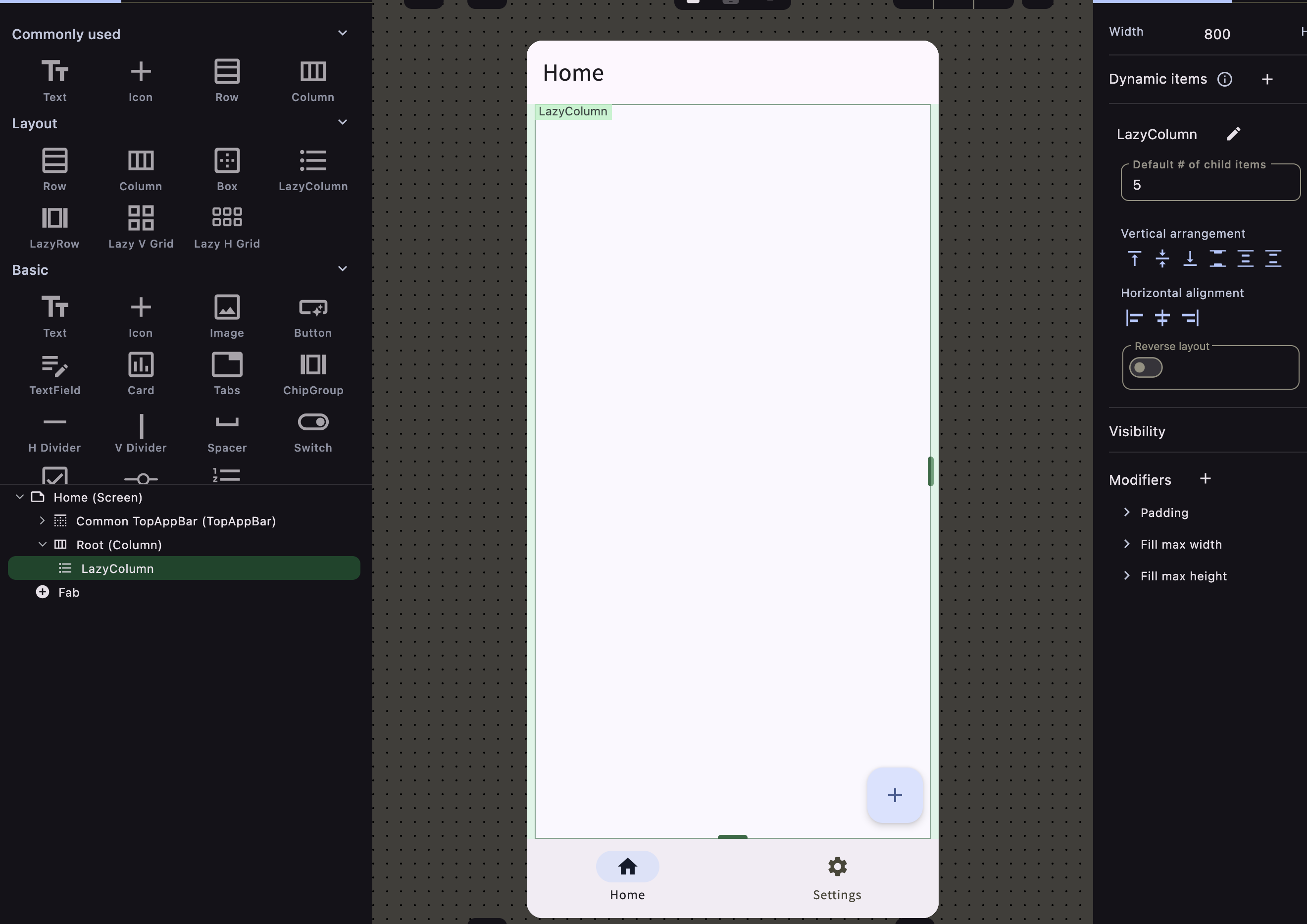
Step 4: Bind the Data Source
-
Access the Dynamic Items Section:
- In the Inspector panel, locate the “Dynamic Items” section.
-
Add a Data Source:
- Click the ”+” button in the “Dynamic Items” section.
- A dialog will appear prompting you to select a data source.
-
Select the Data Source:
- Choose the list state you created earlier (e.g.,
List<Plant>). - Confirm your selection to bind the data source to the lazy composable.
- Choose the list state you created earlier (e.g.,
Step 5: Add a Child Composable
-
Add an Item Template:
- Drag and drop a composable (e.g., Card, Row, Column) into the lazy composable.
- This composable will serve as the template for each item in your list.
Note: Only one direct child of the lazy composable can be bound to the dynamic item.
-
Design the Item Layout:
- Inside the item template, add the necessary UI elements to display the data.
- For example, add an Image for
imageUrland Text composables fornameandspecies.
Step 6: Bind Item Properties to Data Fields
-
Select UI Elements:
- Click on each composable inside your item template (e.g., Text, Image).
-
Bind to Dynamic Item Properties:
- In the Inspector panel, find the property you want to bind (e.g., “Text” for a Text composable).
- Click “Set from State” or the binding icon next to the property.
- A dialog will appear showing available states.
-
Select Dynamic Item Properties:
- You’ll see the properties of the data type (e.g.,
Plant.name,Plant.species). - Select the appropriate property to bind it to the UI element.
- You’ll see the properties of the data type (e.g.,
Only one direct child is able to be bound with the dynamic items.
For example, this is a valid case
LazyColumn - Row (as header) - Row (dynamic items are assigned and generates dynamic number of items) - Row (as footer)but this is invalid
LazyColumn - Row (as header) - Row (dynamic items are assigned) - Row (dynamic items are assigned for different properties) - Row (as footer)Step 7: Configure and Test
-
Adjust Modifiers and Styling:
- Apply any necessary modifiers to style your item template (e.g., padding, background color).
-
Preview the List:
- Use the Preview feature to see how your dynamic list or grid looks with the bound data.
-
Test Interactions:
- If your items are interactive, add actions as needed and test them in the preview or on a device.
Important Notes
-
Single Direct Child Rule:
- The lazy composable can have only one direct child that is bound to the dynamic item.
- This child serves as the template for each item in the data source.
-
Modifiers and Layouts:
- Apply modifiers to the child composable to control spacing, alignment, and styling.
- Use layouts like Row or Column inside the item template to organize content.
-
Data Updates:
- If the data source list updates (e.g., items are added or removed), the UI will automatically reflect these changes due to DragBuilder’s declarative nature.
Once a dynamic item is assigned to a lazy composable, the index of each item in the list becomes available as a state variable. You can use this index to change the appearance of items based on their position in the list.
Example: Alternate Item Backgrounds
- Objective: Change the background color of items alternately (e.g., even items have one color, odd items have another).
- How to Implement:
- Access the
LazyColumnProperties -> Index atstate within your item template. - Use conditional logic or filters to apply different modifiers based on whether the index is even or odd.
- Access the
- Steps:
- Select the Item Template:
- Click on the child composable inside your lazy composable.
- Access the Index State:
- In the Inspector panel, the
Indexstate is available.
- In the Inspector panel, the
- Apply Conditional Styling:
- Use the index to set background colors:
- If
Index % 2 == 0, set background to Color A by using filters. - Else, set background to Color B.
- If
- Use the index to set background colors: